


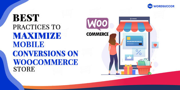
Best Practices to Maximize Mobile Conversions on WooCommerce Store
As a WooCommerce store owner, what do you urge for?
More sales and more conversions!! Right?
It does not matter- if your business goals are wider or short, this is all you want.
You might have tried several techniques to make it happen. But, do all these come valuable? We don't think you have got 100% profitable results.
To sustain in this tough world, it is vital to move with the flow. For some years, mobile devices have become a prominent part of everyone's life. Its usage is increasing to a large percentage. Almost all users are searching and accessing everything on the mobile.
The recent statistics say that more than half of the percentage of web traffic comes from the mobile phone. And it is increasing at a fast pace for some time. It is important for businesses to maximize the mobile conversion rate with an effective marketing strategy.
 Before knowing the optimization, it is imperative to know what mobile conversion is?
The mobile conversion rate is the percentage of the total number of users who choose to participate in the mobile marketing campaign to watch the campaign.
With more percentage, you will have a more powerful mobile marketing strategy. The mobile conversion rate optimization leverages those methods that probably can increase the conversion percentage.
Now; you know that mobile is big, so do WooCommerce. It is interesting to know the combination of both brings in. So, aren't you excited to find out how to boost Mobile Conversions on WooCommerce Store?
Before knowing the optimization, it is imperative to know what mobile conversion is?
The mobile conversion rate is the percentage of the total number of users who choose to participate in the mobile marketing campaign to watch the campaign.
With more percentage, you will have a more powerful mobile marketing strategy. The mobile conversion rate optimization leverages those methods that probably can increase the conversion percentage.
Now; you know that mobile is big, so do WooCommerce. It is interesting to know the combination of both brings in. So, aren't you excited to find out how to boost Mobile Conversions on WooCommerce Store?
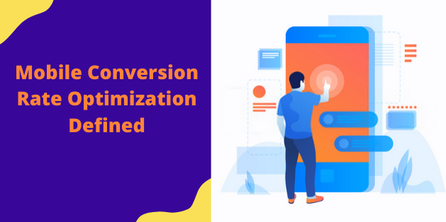
Mobile Conversion Rate Optimization Defined
Before knowing the optimization, it is imperative to know what mobile conversion is?
The mobile conversion rate is the percentage of the total number of users who choose to participate in the mobile marketing campaign to watch the campaign.
With more percentage, you will have a more powerful mobile marketing strategy. The mobile conversion rate optimization leverages those methods that probably can increase the conversion percentage.
Now; you know that mobile is big, so do WooCommerce. It is interesting to know the combination of both brings in. So, aren't you excited to find out how to boost Mobile Conversions on WooCommerce Store?
14 Effective Ways to Improve the Mobile Conversions on WooCommerce Store
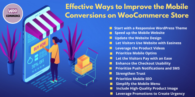
#1. Start with a Responsive WordPress Theme
The custom WordPress theme is the best starting point to have a responsive online store. Remember that the theme is the foundation of the overall website, hence, get the one that fits on every screen-size. To know how to find that type of theme, look at the below tips:- Examine the theme demo on any handheld device. As you apparently do not have your own device in every possible screen size, then you can use the website, such as Website Responsive Testing Tool, for simulating the experience. Every demo element has to look good on every screen size- nothing has to cut-off, hard to use, and difficult to read.
- Find out the responsive features within the theme details. It particularly defines "responsive design" or describes how the themes are adapting to mobile devices.
- Execute the theme-demo via Google mobile-friendly testing tool.
- Evaluate the reviews. Look after the reviews and ratings from the theme user. Find out if there are some negative comments for the responsive design.
- Last but, not least, the themes blend perfectly with WooCommerce. It also limits the responsibility issues with any potential customers.
#2. Speed up the Mobile Website
The other trick in our pocket is the improvement in the mobile conversion rate. For every website, speed plays a vital role. In addition to its long-term commitment to growing the speed of mobile web pages, Google also provides a lot of uncontested evidence. A large portion of the mobile page loading speed is the Rendering start time (RST). It defines how long it demands the first content to be displayed on the screen. The website with the immeasurable mobile RST is 50% more engaged than another website. More increased engagement can improve your chances of boosting the mobile conversion rate. How to assure that your website is as quick as it has to be?- Consider mobile-optimized design or theme, responsive,
- Support Google’s best methods for enhancing mobile page speed.
- Enter your URL in Google ’s mobile page speed checker to understand the website state
- Setting up the caching plugin or system
- Image optimization
- Considering the content delivery network
Get cutting edge Website Design services Today
#3. Update the Website Design
The first impression is important, so it is quintessential to improve mobile website design. Google’s analysis shows that the visitors hardly take less than a second to make a decision regarding your website. Other research confirms that good design for WooCommerce can strengthen trust and support visitors to persevere. It is not true in case of bad design. You surely, have to take care of usability, so the visitors find it simple to get the knowledge they require. Below some ways are given to let this happen:- Possessing a mobile-responsive site design
- Prioritizing the user flow to assure that the mobile visitors are getting the appropriate information to inspire them to convert
- Converting the onsite marketing campaigns responsive
#4. Let Visitors Use Website with Easiness
It is mentioned above as well that how usability is important for your website. This makes online interaction a seamless task. Generally, usability:- Make the experience simple to grasp the new task when the visitors visit your website.
- Assure that when they have an idea about what to do, the overall process is effective.
- Also, ensure that even if they took some break in between, they have the best experience when they return.
- Do not make the process of recovering from errors tough; it has to be easy.
- Focus on components that are chosen, for instance; when classifying choices on an eCommerce store
- When designing your website, leave enough space for users to avoid frustration due to wrong choices
- Make sure that call to action (CTA) can be used to convert the conversion process as easy as possible
#5. Leverage the Product Videos
Attracting visitors’ attention is the initial step to obtaining conversion in the WooCommerce store. According to the video marketing statistics, it is evident that if you want to attract the recognition of mobile users, then there is no better way than videos. It is estimated that:- 79% of customers prefer to see videos instead of reading information about product information
- 84% of customers have purchased the products after viewing the video
- 90% of customers view videos on their mobile devices only
#6. Prioritize Mobile Optins
Several businesses consider optin forms for improving conversions for desktop users. This factor works best for mobile users as well. From the mobile-optimized templates, the superior advanced targeting rules for organizing the non-intrusive mobile marketing campaigns. These campaigns are wholly fulfilled by Google’s latest rules. Several campaigns are used by the campaigns to boost the conversion rate to a higher level. In addition, do not neglect the potential of click-to-call marketing. Nowadays, everyone has a demand to get their queries resolved in just a minute from the prompt phone call in real-time. Furthermore, it is advised to maintain the length of the optin forms, that keeps them short.#7. Let the Visitors Pay with an Ease
You must have tried to pay online from the mobile device and it is definite that most of the time, you have entered the wrong credit card number. It, usually, happens with all. But, it kills the conversion rate. Because the customers find it tough to handle the complex check out process, hence, they abandon the cart. This has not to be this way, otherwise, you will not get profitable results and will notice a decline in the customer retention rate. Hence, enables the visitors to pay from their digital wallets, like, Apple Pay and Google Pay. As per the research from BigCommerce, the conversion rate multiplied when the digital wallets are accessible from the WooCommerce store. Let the customers pay with ease from the reliable payment gateways.#8. Enhance the Checkout Usability
When you are into the online stores, you have to maintain the conversions. The main aim of these businesses is to engage as many customers as they can. Hence, there is one way that improves the mobile conversion promptly is fixing the checkout process. Additionally, make everything easy for them in terms of paying:- The checkout steps have to be decreased. If you can simplify it to one step, that is the ideal choice.
- Display the progress of visitors through checkout within other visual signals and the progress bar.
- From the guest checkout, the visitors can purchase without registering (but can choose to save their specifications after buying)
#9. Prioritize Push Notifications and SMS
If you want to gain more benefits from mobile marketing, then you have to blend the major aspects of mobile platforms in mobile conversions methods. And, the best one among are; Push notifications and SMS messaging- these methods are known for providing the higher conversions in the WooCommerce stores. At least, 75% of the mobile phones receive the text message; which highers the response rate to approximately 45%. The SMS can be used to receive the emails and assist them to get the email list. It, also, makes it accessible for mobile users to leverage the campaigns. Additionally, it is examined that 50% of users find push notifications productive and it improves the engagement by 88%.#10. Strengthen Trust
In any business, gaining trust is of utmost importance, then only the visitors can be converted into customers. So, the question here is how you can build trust when it is about mobile users. In several cases, you might be using some methods for desktop browsers, such as:- Considering social proof by means of reviews and testimonials to convince potential customers that their decision is profitable.
- Assuring them their financial and personal details are safe with you.
- A piece of Adequate information that confirms that you have a genuine business.
#11. Prioritize Mobile SEO
WordPress SEO (Search Engine Optimization) serves customers to locate you by getting the content in search results. With the commence of the Google first index, which uses the mobile website versions for ranking and indexing pages, there is a need for website optimization. It will make mobile users discover your content easily while searching. Failing in optimization will not let the visitors find the website that obviously will decrease the conversion rate of your WooCommerce stores. To start, you can use Google’s mobile testing tool to check how the website reacts with it. With this, you will get suggestions for enhancement- that is important to enhance the website visibility. In addition, the below tips can also be followed to promote the content:- Page titles and descriptions Optimization
- Assure that you have introduced the phrases the visitors are researching for in the content
- Linking with authoritative external websites and internally
Hire our expert developers to receive instant help for your Woocommerce Store
#12. Simplify the Mobile Menu
It is essential to make the mobile phone easy to understand. If you are including the long list of the pages, then you are confusing the website visitors. So, it is better to limit to the main points, and then arrange them in order of priority, with the most relevant pages ahead. If there is a need to integrate several pages then consider the sub menus with broad toggles. Narrow down the main menu items and display sub-menu items as the user grows all menu items. Do not forget to use some symbols, such as an arrow to show that the menu is expanded! Many methods are there that can be used to show the mobile menus, and from all, you can get the one that is appropriate for the visitors. Find them below:- Hamburger menu
- Tab menu
- Floating action button
- Dropdown menu
#13. Include High-Quality Product Image
The users like to see more visual elements as it appeals to them. And, when it is about the WooCommerce Store, the product image has a key value. In the inadequacy of physical contact, the online store depends more on the product image. It works as the point of reference for most of the shoppers. These resolve many of their queries without ever reading the long product details. Below, we have written some of the tips that can help enhance the appearance of the product images:- High-resolution
- Perfect Zooming
- 360° Product View
#14. Leverage Promotions to Create Urgency
As per the experience of the sales guru, below are the four reason that the visitors are not purchasing from your WooCommerce store:- No Requirement
- No Trust
- Not in a Rush
- Time-related scarcity (Last hours to purchase)
- Quantity-related scarcity (Just 2 items are there at this price)
Let's Discuss your Next Project Now