Common WordPress Contact Form Mistakes that are Killing your Conversions
WordPress websites can be a wonderful asset for a business if utilized with a defined plan. For converting viewers into leads, contact forms play a vital role. It can increase your website’s conversion rates, hence bring profit to your business or it can be other way around.
Obviously, a well planned and designed contact form will get you the business flow you want. However, there are many of you whose dream of high conversion rate is just a dream. As I said before, planning. You want success, you need to plan efficiently.
In this post, I will guide you to design an efficient contact form that will increase your conversions. However, my approach is going to be different. Here, I will first give you an overview about some common WordPress contact form mistakes that you need to avoid or else they will hurt your conversions.
So, let’s get started
 Planning is a very crucial exercise for everything. When we talk about contact forms, planning plays an important role. You need to be clear exactly what you want from your visitor. That is the only way to which you will be able to design a form that will be beneficial to your business.
Figuring out what you really need from a form and what you need to do with a form can save you time a ton of time. Asking a few key questions of all of the relevant stakeholders can prevent issues caused by using the wrong tools or having unnecessarily complicated forms.
 Allow me to present you the mistakes that you need to avoid while using contact form for your website.
 When I say communication, I mean effective communication. It is the rule of communication to ask your readers to the point. It also depends upon the information they want to get.
If your reader wants to ask you about your blog then he should also give his email to make you get back to him. He also needs to give his name.
If the query has any geographical importance then he should also mention where he lives.
But no unnecessary information should be sought from the readers. It will irritate them and instead of using a contact form they will just keep silence on the issue which they want to ask. In this way, the process of communication will remain one-sided or they give their opinion in the comment section of your post. It will be a comment irrelevant to your post and you may have to delete it from there.
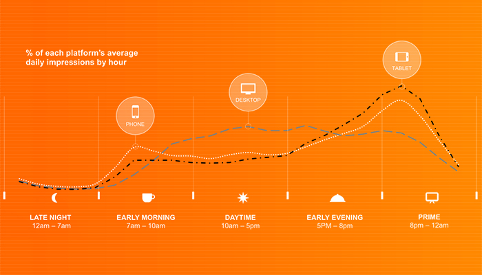 You need to have mobile friendly form. At this point, a non-mobile friendly design is not considered acceptable by the end user or search engine ranking algorithms. Using a mobile-friendly form builder is essential.
Cross-browser testing using a tool like BrowserStack or Blisk should always be a part of your development process. Just shrinking the browser window or checking on your personal phone is not enough.
Believe it or not, it is a high priority stuff. You must optimize your contact form for mobile users.

Plan and Contrive your Contact Forms Well
 Planning is a very crucial exercise for everything. When we talk about contact forms, planning plays an important role. You need to be clear exactly what you want from your visitor. That is the only way to which you will be able to design a form that will be beneficial to your business.
Figuring out what you really need from a form and what you need to do with a form can save you time a ton of time. Asking a few key questions of all of the relevant stakeholders can prevent issues caused by using the wrong tools or having unnecessarily complicated forms.
Common WordPress Contact Form Mistakes to Avoid while Designing
 Allow me to present you the mistakes that you need to avoid while using contact form for your website.
Does your Form gives you Complete Relevant Information about your Visitor?
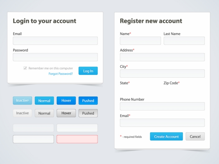
Excessive queries are to be avoided at any cost. Also, too fewer queries can also cause a lot of problems. It is equally not good to get incomplete information from the one who contacted you for a purpose. So put the sufficient columns to get the complete information from the contact person. For common queries related to your blog or pointing any mistake in your content, you must have the columns of name and email address of the person who contacts you. You need to be in the middle ground between excess and fewer queries. An optimum amount of queries will lead you to the betterment of your contact form.Are you Annoying your Visitors with Too Many Queries?
 When I say communication, I mean effective communication. It is the rule of communication to ask your readers to the point. It also depends upon the information they want to get.
If your reader wants to ask you about your blog then he should also give his email to make you get back to him. He also needs to give his name.
If the query has any geographical importance then he should also mention where he lives.
But no unnecessary information should be sought from the readers. It will irritate them and instead of using a contact form they will just keep silence on the issue which they want to ask. In this way, the process of communication will remain one-sided or they give their opinion in the comment section of your post. It will be a comment irrelevant to your post and you may have to delete it from there.
Want to convert more leads into sale? Get a custom designed WordPress website today!
Is your Contact Form Safe?
You cannot guarantee that a form submission will not be intercepted between the browser and the server. But, if the communication happens via HTTPS, which requires a valid SSL certificate, then the risk is minimized almost to zero. Browsers have already started labeling that any form loaded over HTTP with a password as “not secure.” In the second half of 2017, Chrome is planning to report any form as "Not Secure" if it is not using HTTPS. Even if your form isn’t accepting payments or passwords, your customer’s privacy is always important. Using HTTPS respects that privacy and will prevent your site from being labeled insecure, which never looks good. So, make sure that you use the HTTPS and valid SSL certificates. Your customer’s privacy must be paramount for you and your business.Is your Contact Form Mobile Friendly?
 You need to have mobile friendly form. At this point, a non-mobile friendly design is not considered acceptable by the end user or search engine ranking algorithms. Using a mobile-friendly form builder is essential.
Cross-browser testing using a tool like BrowserStack or Blisk should always be a part of your development process. Just shrinking the browser window or checking on your personal phone is not enough.
Believe it or not, it is a high priority stuff. You must optimize your contact form for mobile users.
Did you Rrovide the Turnaround Time of your Response?
This is one of the most common WordPress contact form mistakes, most of us commit at least once in our lifetime. We created a stunning and striking contact form that follows all the norms of a visually attracting contact form. Yet there is a flaw which can actually cost your conversion in a hideous way. That is the deadline for your response. Imagine this, you ask a query to someone and they listen to your query but didn’t answer. Now here, you will have either of these two things in mind. You will either think that the person knows nothing, or he doesn't value you. There is a third scenario as well, where you might approach him again to ask the same query. Same will happen to your viewers. You need to mention the turn around time (TAT) for your reply or else they will either continue asking you the same query or they will leave your website forever. You don’t want that right? So, mention the deadline and make it convenient for your user as well.WordPress Contact Form - Designing it in the Right Way
-
Informations You Want From Your Visitors
Want to convert your website into a business generating mashine? Get a FREE analysis report!
-
Your Form Mustn’t be Complex
Wrapping up
So, these are some of the common WordPress contact form mistakes that can really hurt your conversions. For a quick follow-up, allow me to cater a flashback of these mistakes,- It is the rule of communication to ask your readers to the point. It also depends upon the information they want to get.
- Also, it is equally not good to get incomplete information from the one who contacted you for a purpose. So put the sufficient columns to get the complete information from the contact person.
- You need to have mobile friendly form. At this point, a non-mobile friendly design is not considered acceptable by the end user or search engine ranking algorithms.
- Even if your form isn’t accepting payments or passwords, your customer’s privacy is always important. Using HTTPS respects that privacy and will prevent your site from being labeled insecure, which never looks good.
- You need to mention the turn around time (TAT) for your reply or else they will either continue asking you the same query or they will leave your website forever.
